Colour is one of the most influential choices in kitchen design, but it is also one of the easiest ways for a space to date. In many modern kitchens in Canberra, cabinet colours need to balance current style with long-term versatility so the kitchen feels refined and relevant for years, not tied to a passing trend. At Caliber Kitchens, colour selection is considered alongside layout, benchtops, flooring, lighting and hardware to create kitchens that feel cohesive, practical and lasting.
This article explores cabinet colours that offer personality and visual impact while still maintaining timeless appeal. It looks at enduring neutrals, muted statement shades, darker cabinetry and the importance of undertones, contrast and material coordination. By understanding how colour choices affect longevity, practicality and atmosphere, homeowners can create a kitchen that feels elegant, balanced and adaptable well into the future.
What Makes Kitchen Colours Date Quickly?
Certain kitchen cabinet colours feel fresh for only a few years before looking tired or overly trend-driven. The difference between a timeless palette and one that dates quickly usually comes down to how closely the colour is tied to a short-lived trend and how well it works with fixed elements like flooring, benchtops and appliances. Understanding what causes colours to age badly helps reduce the chance of needing an expensive redesign sooner than expected.
Colours tend to date when they are chosen mainly because they are popular at the time, rather than because they suit the home, the natural light and the way the space is used. This does not mean avoiding personality altogether. It simply means placing stronger colour choices where they can be updated more easily in the future.
Trend-Driven Accent Colours
A common reason kitchens look dated is that a colour designed as an accent shade becomes the main cabinet colour. For a few seasons, high-chroma blues, millennial pink, sage greens or mustard yellows may dominate design feeds. When these saturated tones cover all base and wall units, they can quickly signal the period when the kitchen was installed.
The problem is intensity and coverage. Strong hues across large surfaces reflect more colour onto walls, ceilings and benchtops, amplifying the effect. When trends move on, the entire room can feel anchored to that fashion moment. These colours can still work well, but they are usually better suited to smaller elements such as an island, open shelving, bar stools or decor that can be repainted or replaced more easily.
Colours That Fight Existing Finishes
Even a sophisticated colour can look wrong if it clashes with permanent finishes. Timber flooring with strong orange or red undertones, for example, can make cool greys and some greens look muddy or dull. Warm cream cabinetry beside crisp white engineered stone can make the stone look harsh and the cabinets look yellowed, even when they are new.
When undertones compete rather than complement each other, the overall effect can feel dated faster. Colours age better when they pick up, soften or gently contrast with undertones already present in the flooring, splashback and benchtop. Ignoring those existing finishes often creates a kitchen that feels disconnected, even if each individual material looks good on its own.
Shades That Wear and Age Faster
Some colours highlight everyday wear more than others, which can make a kitchen look older sooner. Very dark matte cabinetry can show fingerprints, dust and minor scratches easily. Very light cool whites can show scuffs around kickboards and handles and may appear patchy if exposed to strong sunlight over time.
High-contrast combinations, such as black base cabinets with bright white uppers, can also emphasise gaps, misalignment or small marks between components. Mid-tone neutrals and slightly softened whites tend to disguise minor wear better and integrate more easily with new finishes. This helps the kitchen remain current for longer.
Safe Cabinet Colours That Add Personality
Safe cabinet colours do not have to be bland. The right neutral or near-neutral can feel current today and still look intentional in ten years. The key is choosing hues with subtle character that work with a range of benchtops, flooring and fixtures, rather than colours that lock the kitchen into one design era.
Focus on colours that respond well to natural light and existing finishes. Consider how the tone will look against stainless steel appliances, warm timber flooring, stone-look benchtops and different hardware finishes. Soft variation in undertone creates interest and personality without overwhelming the room.
Soft Whites
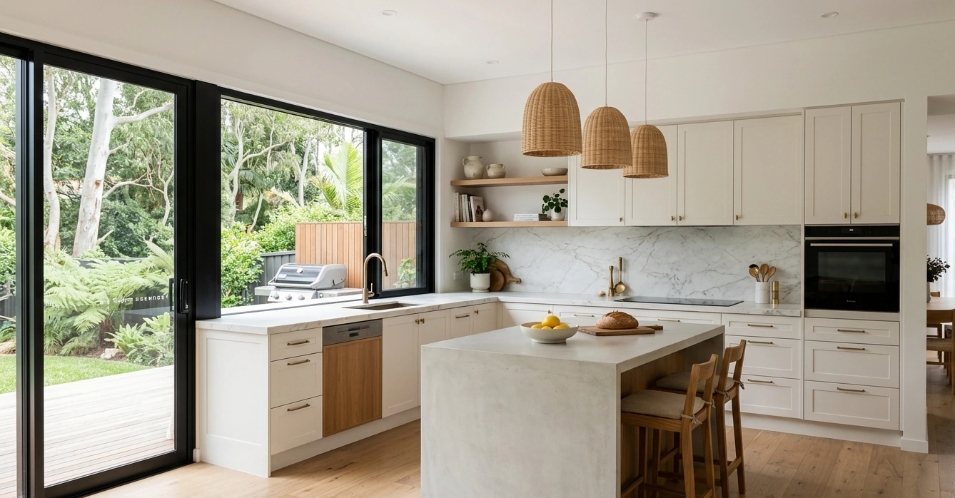
White remains one of the safest cabinet colour choices, but sterile bright white can feel harsh in some kitchens. Off-whites and soft whites with a hint of warmth or grey add depth and suit both traditional and contemporary spaces.
Warm whites with cream or beige undertones complement timber flooring and warmer stone-look benchtops. They are especially forgiving in homes with warm LED lighting because they keep the room bright without creating the stark look of pure gallery white.
Soft white with a touch of grey can suit modern interiors or spaces with cooler light. This type of white pairs well with stainless steel, marble-look surfaces and brushed metal finishes. It also hides minor marks more effectively than a hard, pure white.
Greiges and Light Taupes
Greige, a blend of grey and beige, remains one of the most reliable cabinet colour families. It feels richer than plain white while staying neutral enough to work with changing hardware finishes, splashbacks and wall colours over time.
Light greige creates gentle contrast with white walls and trims and suits both shaker and slab cabinet doors. It hides day-to-day wear better than white while still reflecting plenty of light. This makes it a strong choice in open-plan spaces where the kitchen needs to flow naturally into nearby living areas.
Taupe-leaning greige with a slightly brown undertone adds warmth that works well with hardwood floors and warm-toned stone. It provides personality without becoming as trend-specific as charcoal, navy or bolder feature colours.
For versatility, choose greige shades that sit clearly in the middle, not too cool and not too brown. Test them beside chrome, black and brushed brass hardware to make sure the colour remains balanced.
Muted Blues and Greens
For homeowners wanting more obvious personality without sacrificing longevity, muted blue and green tones can function almost like modern neutrals when carefully chosen.
Soft blue-grey gives a calm, tailored feel and pairs well with white benchtops and light oak. The grey base prevents the colour from feeling overly coastal or themed. It can work particularly well on lower cabinets or an island when paired with lighter upper cabinets.
Sage and grey-green tones bring subtle colour while still feeling grounded. These shades sit comfortably with warm metals such as brass or copper and create a sophisticated backdrop for natural stone, timber and soft neutral walls.
The safest strategy is to choose blue or green shades with low saturation and a clear grey base. Keeping walls, benchtops and major surfaces neutral allows the coloured cabinets to add character without overwhelming the room.
How to Use Dark, Bold or Trend-Led Colours Carefully
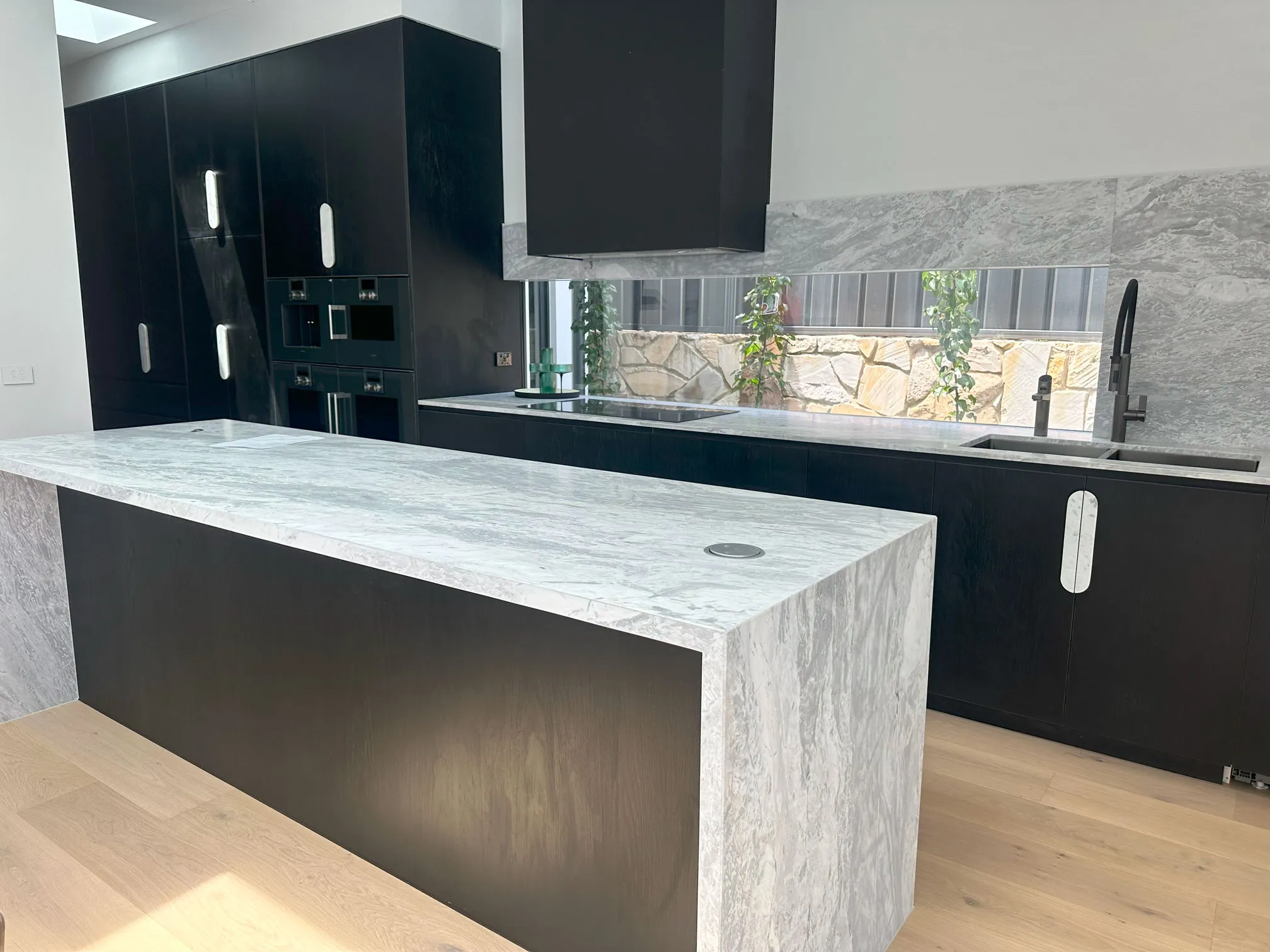
Dark and bold cabinet colours can look luxurious and contemporary, but they are also more likely to date if used without restraint. The key is to treat strong colour as a considered design feature rather than covering every surface in the latest shade.
Used well, deep blues, charcoal, forest green, soft black or other statement tones can add impact while still feeling calm and refined in years to come.
Keep Bold Colours Grounded and Balanced
Dark cabinetry works best when it is balanced by lighter elements. A simple approach is to confine the bold shade to either the base units or the island, then keep wall cabinets in a softer neutral or warm white. This avoids a heavy, boxed-in effect and makes the room easier to refresh later with new paint, hardware or lighting.
Balance strong colour with contrast that feels classic rather than overly sharp. Navy or charcoal often works better with off-white, soft greige or warm stone than with bright white or very cool grey. Rich greens and blacks can also be softened with timber accents such as oak shelves, timber stools or a warm-toned floor.
Use Trend-Led Shades in Contained Areas
Highly trend-led colours such as terracotta, teal or muted mustard are best treated as accents rather than full-kitchen statements. Position them where they can be changed without a major renovation.
A bold colour on a larder cupboard, island or open shelf backing can provide personality while remaining practical to update later. For fitted cabinetry that will stay in place for many years, deeper versions of classic hues such as ink blue, bottle green or soft black generally have a longer style lifespan.
Combining a neutral main cabinet colour with a trend-led island is a practical strategy. If the accent later feels dated, the island can be refinished while the rest of the kitchen remains current. Keeping benchtops and splashbacks relatively simple also prevents patterns and colours from competing, which often dates a space faster than the cabinet colour itself.
Consider Finish, Detailing and Lighting
Finish and detailing have as much impact as the colour itself. Very high-gloss dark doors can show fingerprints and may feel tied to a specific design period. A matte or lightly satin finish gives bold tones more depth and is often more forgiving in everyday use.
Door style also affects longevity. Classic shaker or simple slab fronts tend to outlast decorative routed patterns when paired with statement colours. Minimal, well-chosen hardware in black, brushed brass or stainless steel can complement bold cabinetry without making it feel fussy.
Lighting is especially important with dark or saturated hues. Strong general lighting combined with under-cabinet task lighting keeps work surfaces bright so the kitchen feels inviting rather than gloomy. Warm white lighting usually flatters deeper colours more than very cool lighting, which can make strong shades look harsh or flat.
How Colours Work With Benchtops, Flooring and Lighting
Cabinet colour does not exist in isolation. It can look completely different once paired with a specific benchtop material, floor tone and lighting setup. Getting these relationships right is what separates a timeless kitchen from one that feels dated after only a few years.
A practical approach is to treat cabinetry as the anchor, then coordinate benchtops, flooring, splashbacks and lighting around it. Neutral cabinet colours generally offer more flexibility, but even bolder choices can feel enduring when the surrounding elements are carefully controlled.
Pairing Cabinet Colours With Benchtops
Benchtops sit directly against cabinetry, so the contrast level matters. High contrast, such as white cabinets with black or very dark benchtops, can look crisp and contemporary but may feel stark in smaller spaces. Softer contrast, such as warm white cabinets with light stone-look benchtops, tends to have broader long-term appeal.
For a timeless combination, choose one element to be the feature and keep the other more restrained. If the benchtop has strong veining or pattern, such as marble-look stone or terrazzo, cabinets usually work best in a calm, solid tone such as warm white, soft grey or greige. If the cabinets are a deeper shade, such as navy or charcoal, a lighter benchtop in off-white, pale concrete or light timber-look laminate helps keep the overall look balanced.
Undertone is critical. Cool white cabinets pair more naturally with benchtops that have grey or blue-based flecks, while creamy whites and taupes complement warmer stone with beige or honey highlights. Matching undertones creates a unified, considered look that does not rely on trend colours.
Coordinating With Flooring
Flooring is one of the largest surfaces in the room, so it can clash quickly with cabinet colours if undertones compete. Timber or timber-look floors already carry strong warm or cool notes. Warm oak and honey tones sit comfortably with beige, cream, greige and some olive-toned cabinets. Cooler or greyed flooring suits crisp whites, soft greys and inky blues.
Avoid choosing cabinets and flooring that are almost the same depth and colour unless a very minimal, built-in effect is intended. Slight contrast usually creates a more layered result. For example, medium oak flooring can work well with lighter warm white cabinets or deeper walnut-toned cabinetry, rather than a near-identical oak shade.
Pattern and grain also matter. Busy timber grain or patterned tiles usually benefit from simpler cabinet colours. In contrast, very plain concrete-look flooring can handle deeper cabinet hues without overwhelming the room.
Factoring in Lighting
Lighting can completely change how cabinet colours appear. Natural daylight, warm artificial lighting and cool LED lighting can all shift undertones. A soft grey may appear blue in cooler daylight, while a warm white may look creamier under warm downlights.
This is why cabinet samples should be viewed in the actual kitchen space, not just in a showroom. South-facing rooms, shaded kitchens and spaces with limited natural light may need warmer or lighter cabinetry to avoid looking dull. Bright kitchens with strong sun exposure may handle deeper colours more successfully, provided there is enough task lighting for work areas.
Under-cabinet lighting, pendant lights and downlights should be considered as part of the colour palette, not as an afterthought. The right lighting helps cabinetry, benchtops and splashbacks read as one cohesive scheme.
Final Checks Before You Commit to a Colour
Before placing an order or signing off on a design, test how a cabinet colour behaves in the real kitchen. Paint chips and digital renderings are only starting points. Light, surrounding finishes and even the size of the room can subtly shift a colour from timeless to tired.
A few targeted checks reduce the risk of regret and help confirm that the chosen palette will stay stylish for many years. This stage is less about instinct and more about controlled testing in real conditions.
Test Colours in Real Light
The same colour can look creamy and soft in a showroom, then flat or yellow at home. Always view samples in the actual kitchen space before committing.
Order real door samples or large painted boards, ideally at least the size of an A4 sheet. Move them around the room and check them at different times of day. Morning light, afternoon sun and evening artificial light all affect how undertones read.
Assess the colour under the lighting planned for the finished kitchen. If warm white downlights are being used, test the sample under similar lighting. If a darker island colour is being considered, step back to the distance from which it will usually be seen and check whether it still feels balanced rather than heavy.
Check the Whole Palette Together
Cabinet colour is only one part of the overall kitchen scheme. Benchtops, flooring, splashbacks, hardware and wall colour all need to support it so the room feels cohesive instead of busy.
Lay samples of all finishes together and view them as a group. Place the cabinet colour beside the benchtop, flooring and splashback to check whether the undertones work together. For example, if the flooring has a warm oak tone and the benchtop is warm white, a cabinet colour with a cool blue undertone may feel disjointed.
If two cabinet colours are being combined, such as a darker island with lighter perimeter units, confirm there is enough contrast without competition. The secondary colour should feel like an accent rather than a rival focal point. Check hardware finishes at the same time so handles, taps and cabinet colours work together.
Choosing Cabinet Colours That Last
Timeless kitchen cabinet colour selection is less about avoiding trends completely and more about using colour with balance and restraint. Soft whites, warm greiges, muted taupes and carefully chosen blue or green tones can create a flexible foundation that remains easy to update as styles evolve.
Darker or trend-led colours can still have a place when they are introduced thoughtfully through islands, feature areas or contained accents. When cabinetry, benchtops, flooring, lighting and hardware are considered together, the result is a kitchen that feels cohesive rather than trend-dependent. With the right balance of timeless foundations and subtle character, kitchen cabinetry can continue to feel sophisticated, functional and well suited to the home for years to come.