Bathroom renovations in Canberra can add style, comfort and long-term value to a home, but the wrong choices can quickly make the finished space feel cheaper than expected. At Caliber Kitchens, we often see bathrooms let down not simply by budget, but by decisions that disrupt the overall look and function of the room. Poor layout planning, mismatched finishes, awkward lighting and rushed fixture selections can all undermine the result, even when quality products are used.
In this article, we look at the renovation mistakes that most often make bathrooms look cheap and what homeowners can do to avoid them. Readers will learn which design choices affect the perceived quality of a bathroom, how materials and colour palettes shape the overall finish, and why details such as storage, lighting and hardware matter just as much as tiles and vanities. By understanding these common pitfalls, homeowners can make better decisions and create a bathroom that feels cohesive, durable and genuinely well finished for years to come.
Poor Tile Choices and Inconsistent Finishes
Tiles and finishes shape the overall look of a bathroom more than almost any other element. When colours compete, layouts feel busy or finishes do not relate to one another, the whole room can lose its sense of quality. Even a healthy renovation budget can produce a disappointing result if the selections feel scattered rather than considered.
A bathroom does not need expensive materials to look refined, but it does need consistency. The most successful spaces usually rely on a restrained palette, a clear balance of textures and finishes, and choices that work together under the room’s actual lighting conditions. Instead of treating tiles, cabinetry, benchtops and metal finishes as separate decisions, it is better to plan them as one complete scheme.
Common Tile Mistakes That Cheapen a Bathroom
One of the most common mistakes is using too many different tiles in one room. Most bathrooms only need a main wall tile, a floor tile and, if appropriate, one feature tile used sparingly. Once several colours, patterns or shapes are introduced, the space can start to feel cluttered, dated or visually confused.
Tile scale also plays a big role in how polished the bathroom feels. Small mosaics across a full floor create a lot of grout lines, which can make the room look busy and harder to maintain. At the other end of the scale, oversized tiles in a compact bathroom can leave awkward cuts at edges and corners if the layout is not carefully planned. In many cases, larger-format floor tiles and simple wall tiles in classic patterns such as stacked or brick bond create a cleaner and more balanced finish.
Surface finish matters as well. Using high-gloss tiles across both walls and floors can create glare and draw attention to imperfections, especially under strong artificial lighting. A better approach is often to use softer matt or satin finishes across the main surfaces, then introduce gloss only in a controlled way, such as inside a niche or on a small feature area.
Colour coordination is another detail that can make or break the final result. Stark whites paired with warmer creams or beige-toned finishes can look unintentionally mismatched, even when each product looks good on its own. Tile samples should be viewed alongside vanity colours, benchtops and paint selections in the actual room wherever possible. Warm tones generally sit better with other warm tones, while cool whites and greys tend to work best together in a more contemporary palette.
Mismatched Metals and Surfaces
Even when the tile selection is strong, the bathroom can still feel disjointed if the metal finishes are inconsistent. Tapware, shower fittings, handles, accessories and tile trims all contribute to the overall look. When they are chosen separately without a clear direction, the room can feel pieced together rather than properly resolved.
The simplest approach is to choose one main metal finish and carry it through the key fittings in the room. In some cases, a second finish can work well, but only when it is introduced in a controlled way and clearly supports the overall design. Mixing chrome tapware, matte black frames, brushed nickel handles and brass lighting in one small bathroom usually creates visual noise rather than contrast.
It is also important to pay attention to sheen and texture, not just colour. Highly polished tapware beside heavily brushed accessories or aged finishes can compete with one another and make the room feel inconsistent. The most successful bathrooms usually keep these details closely related so the eye reads the room as one complete space.
Tile trims and edging should be considered at the same time as the tiles and fittings, not left until installation. Cheap plastic trims or poorly matched edging can undermine otherwise good tile work and make the bathroom feel unfinished. Choosing trims that complement the room’s main metal finish helps tie the entire palette together and supports a more polished result.
Overusing Trends That Date Quickly
Bathroom trends can be appealing during the planning stage, especially when certain colours, tile shapes or tapware finishes seem to be everywhere. The problem is that trend-driven choices often lose their appeal faster than expected. When a bathroom relies too heavily on what is currently popular, the space can start to feel dated within only a few years, which can make the renovation look cheaper than it actually was.
A better approach is to build the bathroom around a more timeless base and use trends in smaller, more flexible ways. This allows the room to feel current without locking the entire renovation to a short-lived style. The aim is not to avoid personality, but to make sure the fixed and expensive elements still feel relevant well into the future.
Recognising Trends That Age Badly
Some design choices are more likely than others to date a bathroom quickly. These are usually bold visual features that become strongly associated with a specific period, especially when they are used across large areas of the room. While they may look impressive at first, they can lose their impact once the trend passes.
Common examples include:
- very bold patterned floor tiles used throughout the whole bathroom
- niche tapware finishes such as bright rose gold or rainbow tones
- highly distinctive tile shapes used across every wall, such as fish scale tiles or oversized hexagons
None of these choices are automatically wrong, but problems usually arise when they dominate the entire design. A bathroom tends to hold up better when these more expressive elements are used selectively rather than becoming the foundation of the whole room. One useful test is to ask whether the choice would still feel appealing in ten years. If the answer is uncertain, it is usually safer to use it in a more limited way.
Using Trend-Driven Elements in Low-Risk Ways
Trends are easier to live with when they appear in elements that can be changed without major renovation work. This gives homeowners more freedom to update the look of the bathroom over time without replacing tiles, moving plumbing or changing permanent fixtures.
Safer places to introduce trend-led design include:
- paint colour
- mirrors and decorative lighting
- towels and accessories
- window furnishings
- vanity handles or other small hardware
This approach keeps the overall bathroom more adaptable. For example, the room might use neutral wall and floor tiles, with more current colours or shapes brought in through a mirror frame, feature light or styling details. If tastes change later, those items can be replaced far more easily than fixed materials.
Prioritising Timeless Foundations
The larger and more expensive elements in a bathroom should usually feel calm, practical and long-lasting. That does not mean the room has to be plain. It simply means the core materials should not rely on novelty to create impact.
In most cases, a more durable foundation includes:
- neutral or lightly textured tiles for most walls and floors
- simple tapware in finishes that have broader staying power, such as chrome, brushed nickel or matte black
- vanity colours and materials that are unlikely to feel tied to one brief design phase
Once those core elements are in place, trend-based features can be layered in through a niche, framed mirror, statement light or a smaller tiled detail. This gives the bathroom character without making it feel locked into a look that may date quickly. In the long run, bathrooms that balance timeless structure with carefully chosen accents usually feel more polished and hold their appeal for longer.
Relying on a Single Overhead Light
Lighting has a major effect on how a bathroom looks and feels, yet it is often left too late in the renovation process. A single ceiling light might provide enough basic illumination, but it rarely creates the balanced, functional lighting a bathroom needs. The result is often harsh shadows, dark corners and a flat, uninviting feel that makes the space seem more basic than it should.
A better result usually comes from layered lighting. Instead of expecting one fitting to do everything, the room should combine general lighting for overall visibility, task lighting where people use the mirror, and softer feature lighting where appropriate. Even in a smaller bathroom, this approach can make the space feel more considered and more comfortable to use.
Poorly Placed Vanity and Mirror Lighting
The vanity is the area where lighting mistakes are most noticeable. A single downlight directly overhead or a light mounted only above the mirror often throws shadows across the face, which makes daily tasks more difficult and gives the bathroom a less refined feel.
More even lighting is usually achieved by placing light on both sides of the mirror at around eye level. This helps reduce shadowing and creates a more flattering, practical result. Where that is not possible, a backlit mirror or concealed LED lighting around the mirror can provide a cleaner and more balanced alternative.
Light colour also matters. Very cool lighting can make the bathroom feel stark and clinical, while warmer tones tend to create a more comfortable and polished atmosphere. In many bathrooms, warm white or neutral white lighting in the range of 2700K to 3500K gives a softer effect that works well with skin tones and most interior finishes.
Ignoring Natural Light and Shadow Patterns
Natural light can improve a bathroom more than almost any decorative feature, but it is easy to reduce its impact through poor layout decisions. A window blocked by a tall vanity mirror, solid shower wall or bulky storage unit can leave the room feeling darker, smaller and more enclosed than it needs to be.
During the planning stage, it helps to consider how daylight enters the room and where shadows will fall across the day. Keeping windows and skylights as clear as possible can make the bathroom feel more open and help reduce reliance on artificial lighting. Privacy can still be maintained through frosted glazing, obscure glass or window designs that allow light in without exposing the room.
In bathrooms with limited access to daylight, design choices such as a tubular skylight or an internal highlight window can still improve the sense of brightness. These additions do not have to be elaborate to make a difference. When natural and artificial lighting are planned together, the bathroom usually feels larger, calmer and noticeably more finished.
Lack of Smart Storage and Visual Clutter
A bathroom can have quality tiles, good lighting and attractive fittings, yet still feel cheap if every surface is crowded. When storage is not properly considered during the renovation, clutter quickly takes over and becomes one of the first things people notice. Benchtops fill up, products spill into corners and the room starts to feel smaller, busier and less finished than it should.
Good storage is not about squeezing in as many cupboards as possible. It is about making sure the bathroom has a practical place for the items people actually use every day, while keeping those items easy to access without leaving them on display. When storage is planned well, the room feels calmer, more functional and much more polished.
Planning Built‑In Storage From the Start
One of the most common mistakes is leaving storage decisions until after the main layout, plumbing and fixture positions have already been locked in. At that point, the solution is often a freestanding shelf, a small cupboard or an awkward add-on that looks separate from the rest of the bathroom. These pieces can take up valuable floor space and make the room feel less resolved.
It usually works better to build storage into the bathroom from the beginning. A vanity with deep drawers is often more practical than shallow cupboards because it gives easier access to toiletries, hair tools and everyday items without everything being stacked behind one another. Internal organisers can also help keep drawers tidy so cords, bottles and smaller products do not end up back on the benchtop.
Where space allows, a tall linen cabinet or slim tower unit beside the vanity can be useful for storing spare towels, cleaning products and backup toiletries. Recessed niches in the shower or above the bath are another smart inclusion, giving shampoo and body wash a proper home without relying on hanging caddies or suction shelves that can make the space feel temporary or cluttered.
Avoiding Countertop and Wall Clutter
Even a well-designed bathroom can lose its impact if too many everyday items are left out in the open. Benchtops covered with product bottles, toothbrushes, makeup bags and loose accessories tend to compete with the finishes and draw attention away from the renovation itself. The room may be clean, but it can still feel messy if there is no visual breathing space.
A better approach is to keep only a small number of useful or attractive items on display, such as handwash, lotion or a neatly placed tray. Everything else should have a defined place inside a drawer, cupboard or mirrored cabinet. This helps the bathroom feel more settled and makes the finishes, lighting and cabinetry easier to appreciate.
Small details can also make a difference. Built-in toothbrush storage, mirrored shaving cabinets and vanities with concealed bins or power access all help reduce what ends up sitting out on the bench. These choices may seem minor on their own, but together they make the room feel more intentional and easier to maintain.
Using Vertical and Hidden Spaces Wisely
A smaller bathroom does not need to feel crowded if the available space is used carefully. Vertical and hidden storage can make a big difference, especially when floor area is limited. Instead of adding more furniture, it is often more effective to look at where storage can be integrated into walls, joinery or otherwise unused areas.
Shallow shelving or cabinets recessed into the wall can provide useful storage without pushing further into the room. Space above the toilet, above a doorway or at the end of a vanity can also be used for items that are needed less often, such as spare toilet paper, guest towels or bulk supplies. These additions help keep the bathroom practical without making it feel overfilled.
Under-vanity kickboard drawers are another example of storage that improves function without adding visual bulk. They make use of the plinth area for flatter items such as scales, cloths or spare toiletries while keeping the outside of the vanity clean and simple. When these kinds of solutions are built into the renovation, the bathroom tends to feel more tailored, more spacious and better thought through.
Layout Decisions That Reduce Comfort and Flow
Layout has a major influence on whether a bathroom feels well designed or frustrating to use. Even quality tiles, cabinetry and tapware can lose their impact if the room feels cramped, awkward or poorly organised. When circulation is tight, fixtures compete for space or privacy is overlooked, the bathroom can quickly take on a cheaper feel regardless of the products used.
A good layout should make the room feel easy to move through and comfortable to use every day. That means thinking carefully about how doors open, where key fixtures sit, how much clear floor space is available and whether the room works properly for one person or more. When these practical details are resolved early, the bathroom tends to feel calmer, more spacious and more considered.
Crowded Pathways and Clashing Doors
One of the most common layout mistakes is not allowing enough clearance around doors, screens and fixtures. If people have to squeeze past the vanity, angle themselves around the toilet or work around doors that clash, the room can feel immediately awkward. These problems are especially noticeable in smaller bathrooms, where every movement counts.
A more comfortable layout allows clear access to the main zones of the room without obstruction. Entry doors should not swing into the vanity or shower screen, and shower doors or panels should not interfere with the toilet, towel rail or circulation path. In many cases, a fixed shower screen, sliding screen or cavity slider at the entry can improve flow and free up valuable usable space.
As a practical guide, it helps to allow comfortable walking space in front of major fixtures and to check that drawers, doors and screens can all open fully without conflict. Bathrooms tend to feel more refined when movement through the room is straightforward rather than restricted by layout compromises.
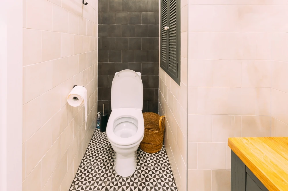
Inconvenient Positioning of the Toilet
The toilet has a strong effect on how the bathroom feels, particularly when it is the first thing visible from the doorway. Even in a well-finished room, this can make the layout feel more basic and less considered. Positioning also affects comfort, privacy and how open the space feels overall.
Where possible, the toilet should sit slightly out of the main sightline rather than becoming the focal point of the room. This might mean placing it behind the door swing, beside a short nib wall or in a more visually recessed part of the layout. In larger bathrooms, a partially screened or separate toilet area can also improve privacy and make the space feel more functional for family use.
Comfort around the toilet matters as well. It should have enough clearance on both sides to avoid feeling boxed in by the wall, vanity or shower screen. When the toilet is positioned with proper spacing and some visual separation, the bathroom usually feels more balanced and better planned.
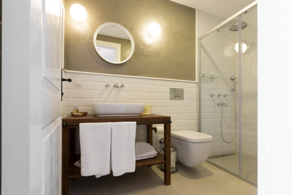
Poor Vanity Placement and Shared Use Problems
The vanity is one of the most frequently used areas in the bathroom, so its position needs to support both comfort and function. When it is pushed tightly into a corner, placed too close to another fixture or given too little surrounding space, the whole room can feel compromised. Even a high-end vanity can lose its impact if it is awkward to stand at or difficult to share.
A better layout gives the vanity enough width, clear standing space in front and practical access to drawers, cupboards, mirrors and power points. This becomes even more important in bathrooms used by two people, where basins placed too closely together or limited elbow room can make the space feel cramped very quickly.
Mirrors, shaving cabinets and lighting should also be positioned so they are easy to use without leaning awkwardly over the basin or reaching into tight corners. When the vanity zone is given the space it needs, the bathroom tends to feel more comfortable, more functional and far more intentional in its design.
How to Achieve a High-End Look Without Overspending
A bathroom does not need an extravagant budget to feel polished and well resolved. In many cases, the difference between a bathroom that looks expensive and one that looks cheap comes down less to price and more to restraint, consistency and smart decision-making. Choosing where to invest, where to simplify and how to keep the finishes working together often has a bigger impact than filling the room with premium products.
The aim is to spend money where it will be seen, felt and appreciated every day, while keeping the rest of the design calm and cohesive. When the layout is strong and the materials are selected carefully, even modest finishes can look far more refined than a room full of expensive but poorly coordinated choices.
Prioritise Key Feature Items
Most high-end bathrooms have one or two standout elements that anchor the design. Rather than trying to upgrade every item in the room, it usually makes more sense to focus the budget on the features that are most visible and hardest to replace later. These are the elements that shape the overall impression of quality.
In many bathrooms, the best places to spend a little more are the vanity, benchtop, tapware, shower fittings and shower screen. A well-made vanity in a simple profile often looks more expensive than an overly decorative unit made from lower-grade materials. The same applies to tapware. Solid, well-finished fittings tend to elevate the room more effectively than trend-driven designs that look impressive at first but do not wear as well visually.
A clear frameless or semi-frameless shower screen can also make a bathroom feel cleaner and more open, particularly when the surrounding finishes are simple. Focusing on a few strong elements like these usually creates a more convincing sense of quality than spreading the budget too thinly across every surface.
Use Affordable Materials in a Thoughtful Way
A bathroom can still feel high-end when more affordable materials are used with discipline. What matters most is not whether every finish is premium, but whether the materials sit well together and are used in a way that feels deliberate. Consistency in colour, scale and texture often creates a more expensive look than using too many statement products at once.
Porcelain tiles are a good example. Many porcelain ranges can achieve a stone-look finish at a lower price point while still offering durability and easier maintenance. Larger-format tiles in particular can make the room feel calmer and more spacious by reducing the number of grout lines and keeping the visual field simpler.
Cost savings can also come from using materials selectively. Tiling only where it is practical, such as wet areas and splash zones, and finishing the remaining walls with quality moisture-resistant paint can reduce cost without making the bathroom feel incomplete. In the same way, limiting feature tiles to one wall, one niche or one focused area usually has a stronger result than trying to create impact across every surface.
Upgrade the Details That People Touch and See
Small details often have a bigger effect on perceived quality than people expect. Items that are handled every day or noticed at close range can influence whether the bathroom feels basic or well finished. These details do not always add a large amount to the budget, but they can make the room feel much more resolved.
Handles, finger-pull cabinetry, towel rails, robe hooks and toilet roll holders all contribute to the overall impression. When these pieces are coordinated with the tapware and chosen with the same finish in mind, the bathroom tends to feel more intentional. A mirror that is well sized to the vanity and properly integrated into the design can have the same effect, helping the room feel custom rather than assembled from separate parts.
Lighting is another area where a relatively modest upgrade can make a noticeable difference. A bathroom will usually feel more refined with balanced vanity lighting and a softer overall glow than it will with one harsh ceiling fitting. Warm white LED lighting also tends to create a more flattering and inviting atmosphere, which helps the finishes read better and gives the room a more considered look.
A bathroom renovation does not need to be extravagant to feel high-end, but it does need to feel well planned. The bathrooms that look the most refined are usually the ones where the layout works, the materials relate to one another and the practical details have been considered just as carefully as the visual ones. When those foundations are right, the space feels more comfortable to use and holds its appeal far better over time.
Avoiding the mistakes covered in this article can make a significant difference to the final result. Poor lighting, cluttered layouts, mismatched finishes and trend-heavy choices can all make a new bathroom feel less polished than it should. By focusing on consistency, function and smart material choices, homeowners can create a bathroom that feels cohesive, durable and genuinely well finished without overspending.